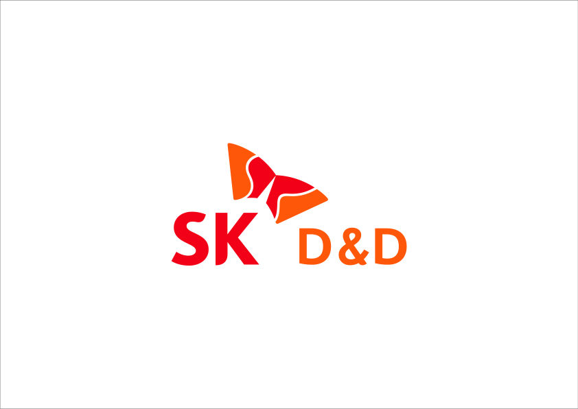
SK colors
SK RED
- Pantone Color186C
- Process ColorC0 / M100 / Y81 / K4
- RGB ColorR234 / G0 / B44
SK ORANGE
- Pantone Color158C
- Process ColorC0 / M61 / Y97 / K0
- RGB ColorR255 / G122 / B0
Here we introduce the CI and BI of SK D&D.
The SK identifier is completed by the combination of the symbol and logo mark.
The rules and principles of their combination must be followed to effectively
represent our company's pursuit of "Customer Happiness".
The symbol is placed at the upper right of the logo mark, considering that
the Happiness Wing visually progresses in that direction.
Assuming that the height of the logo mark "K" is X, the size of the symbol is 1.1 x,
and the distance between the symbol and the logo mark is 0.25 x.
SK Red in the logo and symbols is a dynamic and energetic red, and SK Orange is a color that symbolizes "happiness, friendliness and hospitality".
SK identifiers are based on the principle of using the designated colors on a white background.
We create a sustainable living culture by
providing spaces and services that
reflect the lifestyle and characteristics
of 1-2 person households.
With this goal, we are transforming the
strata offices from an
apartment-like factory to a user-centric,
creative space.
We provide innovative office spaces
through various leasing methods and
rich amenity services.